Congo through rose-tinted glass
Written by Ciara Leeming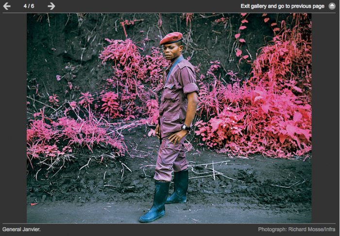
“Bereft of a clear narrative, journalists and photographers often confine themselves to stories of suffering, anchored in bleak statistics: 400,000 rapes in one year; 5.4 million deaths between 1998 and 2007. Richard Mosse’s pictures of Congo draw from a different palette of colours, literally….It feels as if we have fallen down a rabbit hole, into a more surreal space. Congo always felt that way to me, as if the regular colour spectrum, the usual yardsticks we have, do not quite hack it.
“…But where this technology was invented to detect enemy positions in the underbrush, Mosse uses it to make us call into question pictures we thought we understood. These are the images we take for granted from Congo: the ruthless militia commander, the rape victim, an unwitting peasant. But in Mosse’s pictures, Congo’s photographic clichés are represented in a counterpoint of electric pink, teal blue and lavender. By representing the conflict with an invisible spectrum of infrared light, he pushes us to see this tragedy in new ways.” – Jason Stearns, Guardian
Let me start by saying I like Richard Mosse’s Congo in Pink project in the Guardian today. Visually they are beautiful, if very bizarre. But can a photographic technique really “push us to see tragedy in new ways”? Personally I think that’s a big stretch – it could surely be argued that here, as with the Holga or Hipstamatic-type war photos we see so often now, that what we end up discussing is form rather than content. Which is in no way to do down Mosse or his series – I suspect this hyperbole is probably more down to the feature writer than the photographer himself. I’d just be interested to know what others think.
Discussion (5 Comments)
Thanks for posting this Ciara. Can’t really say I’m mad for the pics. Nothing beats the real colors of the parts of the DRC I visited.
Any idea what’s going on with the captions? Some of them seem a bit of a pisstake.
The ‘captions’ are a joke. I don’t see the conflict, or the Congo, in new ways, I just see it in pink.
There’s a much fuller explanation from Mosse here but I’m still not convinced there’s enough depth for me http://jmcolberg.com/weblog/extended/archives/a_conversation_with_richard_mosse/
Agreed – the captions are terrible
These have been doing the rounds for a while now. When I first saw them I glossed over them, but then came back to them and read the back story. I like the idea from an intellectual point of view but ultimately it is presented in a way which removes us from the situation. We need the whole context to properly read the pictures. Once you find out who and what the photos are of then you have an “Oh, I see” moment. The Fine Art (with capitals!) Titles further remove the work from the reality of the situation and without an accompanying text to explain the photos, the process and the subject the whole thing ends up looking like something from a sci fi movie rather than an exploration of the very real events in the DRC. Great for decoration on a gallery wall but not so great for the expansion of our knowledge, the deepening of our understanding or in moving us closer to a solution. I think it is a great idea that has (for me) been presented badly and in the wrong context. The Fine Art world seem to love it…
I think in a time when photojournalism is forever trying to reinvent itself, it’s great that it reopens eyes to images that have long grown long in the tooth. An A for effort, but I don’t know how it’ll effect discourse, if at all, at best- it’s a one trick pony. Weird colors, selective focus, they’re all cool gimmicks, and they do undoubtedly serve their purpose, until the fad grows tired.